
| Contents |
General Comments
|
Communicating to your audience IN any communication, you must
think of your audience and pitch your communication at them. This may seem to
be an obvious statement, but in reality it is very difficult.
Use simple words. Bob hasn't "gained profitable employment", he's got a job. See what I mean? Sententious communication appurtenances are preferable. Sorry; it's better to use short words. Oh, and short sentences, too. Spelling is important. Get it right. This is especially important with people's names. Any spelling or grammatical errors will draw the focus of attention away from your message. |
![]()
| Fonts
and Typefaces
A major temptation that must be resisted is using lots of different typefaces on a page (strictly not "fonts" but "typefaces". "Times italic 12pt" is a font; "Times" is a typeface, "italic" is a style and "12pt" is a size). No more than two contrasting typefaces should be used. What you can do is change the size and style, expand or condense, increase tracking, reverse (that's white text on a black background, but I recommend only with bold type) to maintain visual interest. Many modern DTP programs offer the opportunity to manipulate text into different shapes, and include text within graphical designs. Micrsoft's WordArtis an example of this. The more the text looks like a graphic, the less important it is to stick to the rule on the nuimber of tyoefaces. |
Bold text
Italic text All in the same typeface! |
![]()
|
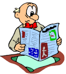
Using Graphics It is becoming increasingly
essential to maintain visual interest by using graphics. Unless you can afford
the luxury of photographs all the time, other graphics, such as prepared
Pictures do more than add to the story. Even a fairly neutral image can have a powerful effect. Graphics break up the page, make it more attractive and easier to read. They help identify the page, too. Use graphics to give the page "balance". This doesn't mean make it symmetrical, but rather pleasing to the eye. This is too deep a subject to go into here; visual balance is more easily recognised than described! There are plenty of books available on desktop design if you want to investigate further. |
![]()
|
How to make best use graphics:
|
![]()
Posters and Handbills
|
Posters — or window bills — should be eye-catching and provide only the minimum necessary information. People will only read these in passing. Use bright colours (not necessarily fluorescent) and one eye-catching motif. The poster should be attractive enough to stop people in their tracks, interesting enough to be read and inviting enough to get a response. The keyord in communication is AIDA:
Get your message over in 5 lines if you can, but certainly no more than 8 lines. Include what you're advertising, where it takes place (don't assume everyone knows which street your church is in!) and when it's happening. Then say to people why they should want to go! 
Graphics on posters are to be used sparingly. You may only need one large one, but it has to be a good one! Look for an image that would appeal to non-churchgoers as well as members. A vector format picture would increase in size without loss of clairty. If you want to get good coverage, visit all the shops in your neighbourhood. Give consideration to the size of the poster. A3 (Double US Letter) is about the biggest most shops will accept for display. Have a few A4 size/US Letter, just in case. Many shopkeepers might take a poster so as not to offend you, but really don't have the will to display it. Better they let you keep the poster! To overcome this, take some non-destructive sticky tape and Blu-Tak or similar and display it for them! The salesman's "alternative close" (Shall I put it in the door or in this window?) is better than asking a question to which the shopkeeper can say "no". |
![]()
|
Handbills should be designed to look like the
posters. They must obviously be from the same family and advertising
the same event. But they should not simply be smaller copies of Traditionally, handbills are A5 size. But why not try A6 for a change (if it doesn't make the print too small)? Alternatively take a sheet of A4 and make a Z-fold by placing two equidistant folds parallel to the short edge? |
![]()
Newsletters and Magazines
|
Writing News Articles In writing a news article, present it as news and say what the story's about right at the start. Consider these:
and
The second one is much more "newsy". It says what the situation is now (the club is looking for a secretary) and says exactly why in simple language. Look at the news items in the "serious" newspapers (they're normally on the first two or three pages) and you'll find that you'll know exactly what the story is all about by reading the first few words. Include the "5 Ws"—Who, what, why, when, where-in your report in descending order of importance. If you've written too much, you can cut the story from the bottom without losing the most important points. |
![]()
|
Covers and size The cover of each issue should be different. It should make people want to read what's inside. Too many church magazines have a picture of a church building on the front and an advert for the local undertakers on the back! Don't fall into that trap; what news-stand publications do that? If you can't put news articles on the front cover, at least change your picture. A common size is an A5 (Half US Letter) page. Prepare it on A4 (US Letter) and reduce-copy it. You'll get better clarity. Use bigger type than normal (14pt comes out at about 10pt). |
![]()
|
Layout Layout your magazine or newsletter on
a base grid. Use a grid of 6 columns, but never run 6 text columns on
an A5 (half US Letter) sheet. With 6 grid columns you can have two Each page should have a main story. It may also have one or more subsidiary stories. Try to avoid causing a reader's eye to go from the bottom of one column right to the top of the next column. There are two good ways of avoiding this. One is for the judicious use of graphics. The other is to shape your main story like an upside-down "L" with a shorter story or graphic in the corner space. |
![]()
|
Style and Usage As an editor, you should be using a consistent style and your English should be correct. Word Processor style sheets are one help, but they can't do everything. For example, should you use "maybe" or "perhaps"? Capitals are often a problem. The
simple rule is "if in doubt, leave them out". For
Foreign words and phrases are sometimes italicised. Does this rule apply to "ex-officio" (also should the hyphen be there)? What about "ad hoc"? Make sure you know about frequently misused words, e.g. "imply" and "infer". Apostrophes are often misued. Generally, do not put an apostrophe before an 's' if the 's' is only there to make a plural. There are some excellent books to help get your English right.
|
![]()
|
When English isn't English There are differences in English and
American spellings. In the USA "-ize" ends words The point is, you should write what
is correct for your audience. The So what do you? My suggestion is to write in your native version of English. If you're from a non-English speaking country, just do your best! If your English is good enough, aim for British (or international) English. However if your audience is mainly US or Japan, use American English. Choose a style and stick to it. Don't mix styles. If you're not sure about anything it's a good idea to get someone in the target country to comment on it before publishing. |
![]()
| In case you were wondering, "perhaps" is preferred. "Ex-officio" should be set in roman (i.e. non-italic) type. It takes a hyphen as an adjective, but not as an adverb. If your committee has an ad hoc meeting, be sure to use italics. A person who implies something is suggesting it without making a direct reference. You infer when you deduce something from what someone else has said. |
![]()
Teaching Materials
|
Handouts Stick to keywords and phrases - the handout should help remind the student of what was said, not replicate the presentation. It is best to be concise. That is why handout materials can make copious use of graphics. For example, instead of listing the Ten Commandments, why not present in graphical form? There should also be space for students to make their own notes. |
![]()
| Presentations
Vector graphics will enlarge nicely to whatever size paper you can print on! Even use A4/Letter size illustrations as part of a whole. If you are using a computer based presentation (such as Powerpoint), then colour graphics are ideal. |
|
Overhead Projectors If you are using an overhead projector, don't forget you can get special acetates for computer printers. DON'T use ordinary acetates: inkjet printers will smudge them and they'll melt inside your laser printer. Get the right materials! Make sure your text and detail is large enough to be seen from the back of the group. Generally speaking ordinary sized type for paper (up to 12 point) is a waste of time. Five lines of text spread across the page is a rule-of-thumb. Better still, cut down the words and use graphics instead. Pictures are much more interesting than words. Explaining a situation with the aid of a picture works well. |
![]()
© Brian Nichols 1999 all rights
reserved.
email:
 For example, many people cannot
get away from church jargon when talking to outsiders. If we use an "in"
language to people who are not "in", they'll lose interest and be put
off.
For example, many people cannot
get away from church jargon when talking to outsiders. If we use an "in"
language to people who are not "in", they'll lose interest and be put
off.  clip art etc., are a must.
  the
posters. People get more time to read handbills. You can use graphics
a bit more and put more information on them. Use all the information
from the posters and add to it. You might even want to include a phone
number.
the
posters. People get more time to read handbills. You can use graphics
a bit more and put more information on them. Use all the information
from the posters and add to it. You might even want to include a phone
number.  text
columns 3 grids wide, or three columns, 2 grids wide. Or you can a have
a 4 plus 2. To be very creative have a 2 and a 3, using a single column
for "creative use of blank space" (this will probably work better in
a magazine). Don't be boring and have a magazine or newsletter with
one wide column on each page!
text
columns 3 grids wide, or three columns, 2 grids wide. Or you can a have
a 4 plus 2. To be very creative have a 2 and a 3, using a single column
for "creative use of blank space" (this will probably work better in
a magazine). Don't be boring and have a magazine or newsletter with
one wide column on each page!  example, "church" is correct for a building or group of
Christians. "The Church", when referring to the universal body of Christ is
capitalised as is a name: "St. Mary's Church". The vicar, church treasurer and
chairman of the PCC probably won't like the fact that lower case for their
titles is correct!! Unless, that is, the title is used as part of their name.
"The church needs a new pastor" is correct capitalisation, but capitalising "P"
in this sentence is correct because it is treated as part of a name: "The
treasurer invited Pastor Smith to have a meal".
example, "church" is correct for a building or group of
Christians. "The Church", when referring to the universal body of Christ is
capitalised as is a name: "St. Mary's Church". The vicar, church treasurer and
chairman of the PCC probably won't like the fact that lower case for their
titles is correct!! Unless, that is, the title is used as part of their name.
"The church needs a new pastor" is correct capitalisation, but capitalising "P"
in this sentence is correct because it is treated as part of a name: "The
treasurer invited Pastor Smith to have a meal". in the UK it is "-ise". In England, colour, honour
and saviour are among the words that include a penultimate "u". "Programme"
is English, "program" is American (except in the computing context!).
Other English speaking countries have other variants.
in the UK it is "-ise". In England, colour, honour
and saviour are among the words that include a penultimate "u". "Programme"
is English, "program" is American (except in the computing context!).
Other English speaking countries have other variants. challenge comes when you are writing for an international
audience (e.g. the world wide web). You will then have to cope with
idioms and vocabulary that may not be universally understood (e.g. "Mind
how you go" in the UK better expressed as "Take care" in the US. An
American may need "a wrench to fix his truck" but the English man will
want "a spanner to mend his lorry." And once it is repaired (! -says
he taking a mid-Atlantic word!) the American will happily drive along
the pavement. You can't do that in England. "Pavement" is the term English
people use for "Sidewalk".
challenge comes when you are writing for an international
audience (e.g. the world wide web). You will then have to cope with
idioms and vocabulary that may not be universally understood (e.g. "Mind
how you go" in the UK better expressed as "Take care" in the US. An
American may need "a wrench to fix his truck" but the English man will
want "a spanner to mend his lorry." And once it is repaired (! -says
he taking a mid-Atlantic word!) the American will happily drive along
the pavement. You can't do that in England. "Pavement" is the term English
people use for "Sidewalk". Use
no more than about 7 bullet points to a page. Use graphs rather than
figures and illustrations rather than descriptions. Split each page
up into small bites. Minimise the number of points made - only one key
point per page.
Use
no more than about 7 bullet points to a page. Use graphs rather than
figures and illustrations rather than descriptions. Split each page
up into small bites. Minimise the number of points made - only one key
point per page.